Hendren Associates
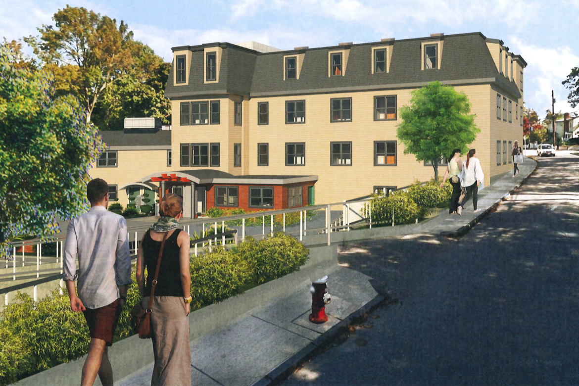
A rendering of the new proposal for 101-103 Morse Street, which now has 36 apartments, down from the original 45.
Developers of the former massage school on Morse Street went back to the drawing board and came back with a new design for an apartment building that pleased that Planning Board.
Wednesday night, the Planning Board voted to recommend to the Zoning Board (which will make the final decision on the project) that it approves the latest design. The project will need a special permit to switch from a commercial to a residential use.
The first proposal sought to make 45 apartments in the complex at 101-103 Morse Street, just off Watertown Street. The Zoning Board told developers it was too dense, so the designers came back with a 40-unit apartment building in June 2017. Again they were told there were too many units in the building.
On Wednesday, architect Gary Hendren of Hendren Associates presented the second revised plan, which included 36 apartments.
Along with the reduced number of units, designers increased the amount of landscaped area and increased the amenity space for residents, Hendren said.
“There were two units at the ground level previously that have been completely removed,” Hendren said. “We increased the social space, we’ve put in a workout room and we have indoor parking space for 26 bicycles. And we’ve increased the size of the townhouse-style units at this level.”
There will also be two laundry rooms and storage areas for each apartment. The windows will also be enlarged to allow more light into the apartments, Hendren said.
Planning Board member Jason Cohen, who used to sit on the Zoning Board, and he commended the architect and the owner for the new designs.
“I was on the ZBA when the case came in front of us. I know was a difficult session for the owner,” Cohen said. “I am glad you came back and took another shot at it, and really listened to the ZBA’s feedback. I see a major improvement in the project. I feel this is an example of the system working.”
Resident Joan Vachon said that having 36 units on the site is much more conducive to the neighborhood.
“We are happy we will have neighbors rather than businesses and a school with 300 students coming and going every day,” Vachon said.
An issue that still must be worked out is the parking situation. Part of the lot belongs to the Town, but to get there, vehicles and pedestrians must use the driveway, which is part of the property belonging to the building.
The Town had an easement agreement with the property owner, but it lapsed, said Watertown Senior Planner Andrea Adams. The Town will negotiate a new deal to allow motor and pedestrian traffic to access the municipal section of the lot, which is near Capitol Street, Casey Park, so it can be used by residents for overnight parking during the winter, Adams said.
“The easement, in the Town’s view, should be for the life of the special permit, as opposed to in perpetuity,” Adams said. “That way it allows another crack at it should there be a change in the use.”
Town Councilor Lisa Feltner, who represents the area, said she was glad to see the improvements in the plan and looked forward to the Town Council discussing a new agreement to give access to the Town-owned parking area.
Planning Board member Payson Whitney said he recalled discussion of pollutants on the site from previous discussions of the project. Hendren said the site has a permit from the state Department of Environmental Protection for commercial use of the property, but they would need to get a new permit to allow residential use. He added that the area of concern for pollution covers about 10 percent of the total site.
The project will next go to the Zoning Board of Appeals, which is next scheduled to meet on June 27 in Town Hall.

That is one ugly building. What’s happened to all the good architects? Too bad it’s so close to the street, but less apartments is better for the neighborhood.
Yes it is close to the street. I forgot to mention it is an existing building being renovated.
The nod to the traditional (in New England) mansard roof is a nice touch, but the building needs more architectural detail to make it look more attractive. The faces of the building are pretty blank and banal. The residents of the area deserve something better to look at, and a prettier building will only increase its appeal in the marketplace.
Why would anyone want to have their windows right up to the sidewalk?
Existing building or no. If it were me I would want to take the opportunity to pull it back.
Or turn it into a proper glass front on business on the bottom and recess the top floors back.
Quite unattractive as it’s shown.